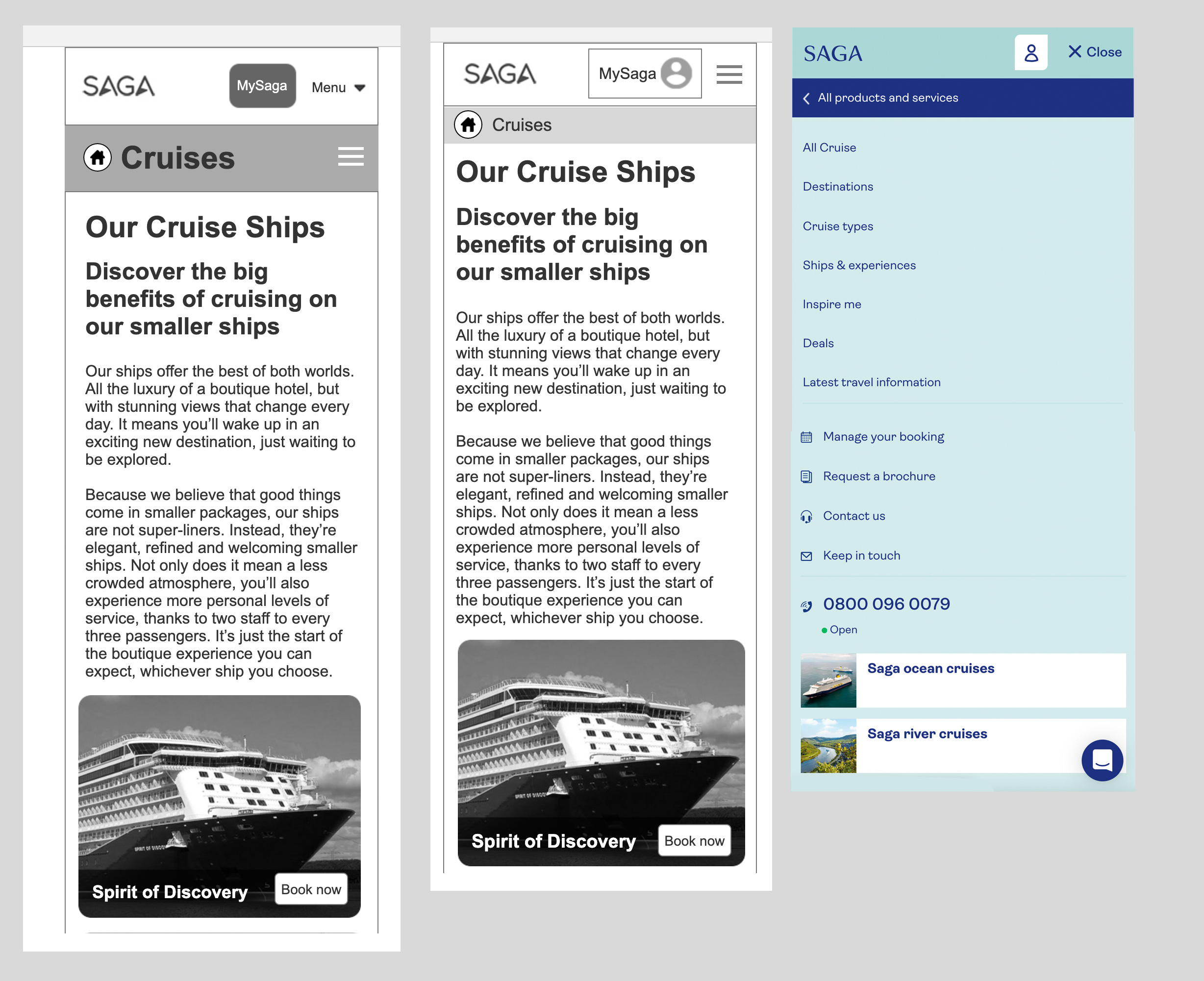
Solving the UX for the global navigation across all Saga websites
Overview
Redesigning a new global nav for the Saga suite of websites to bring uniformity
A new global nav to create a shared navigation that spans across all Saga business units, that will facilitate navigation between business units. Allow users to access a standardised sub navigation within each business unit. Centralised CMS management for the entire navigation system.
The approach
Competitor review.
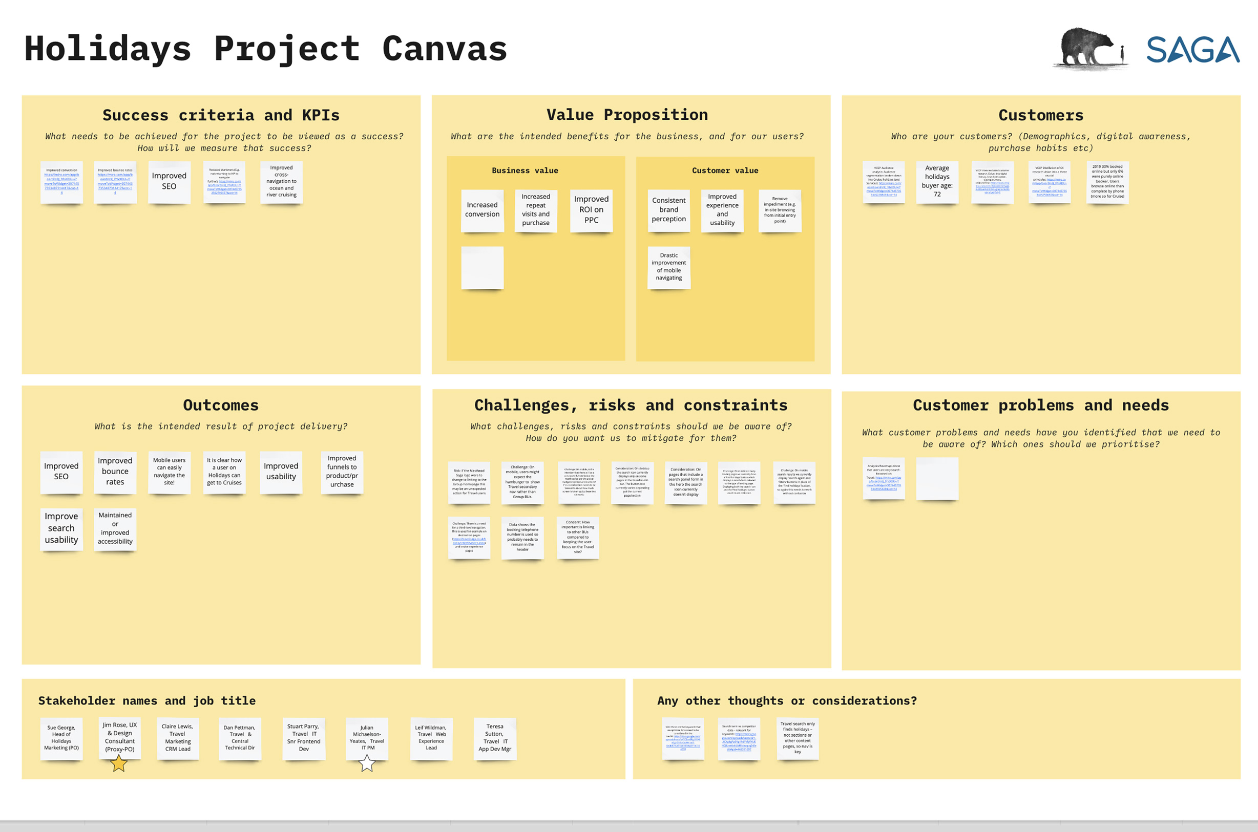
Project canvasses workshop.
Customer outcomes creation (aligned with business outcomes).
Defined epics, themes and stories.
Navigation sitemap for navigation hierarchy workshop.
Information architecture for BUs (SEO data).
Define user journeys (eg identify multiple funnels).
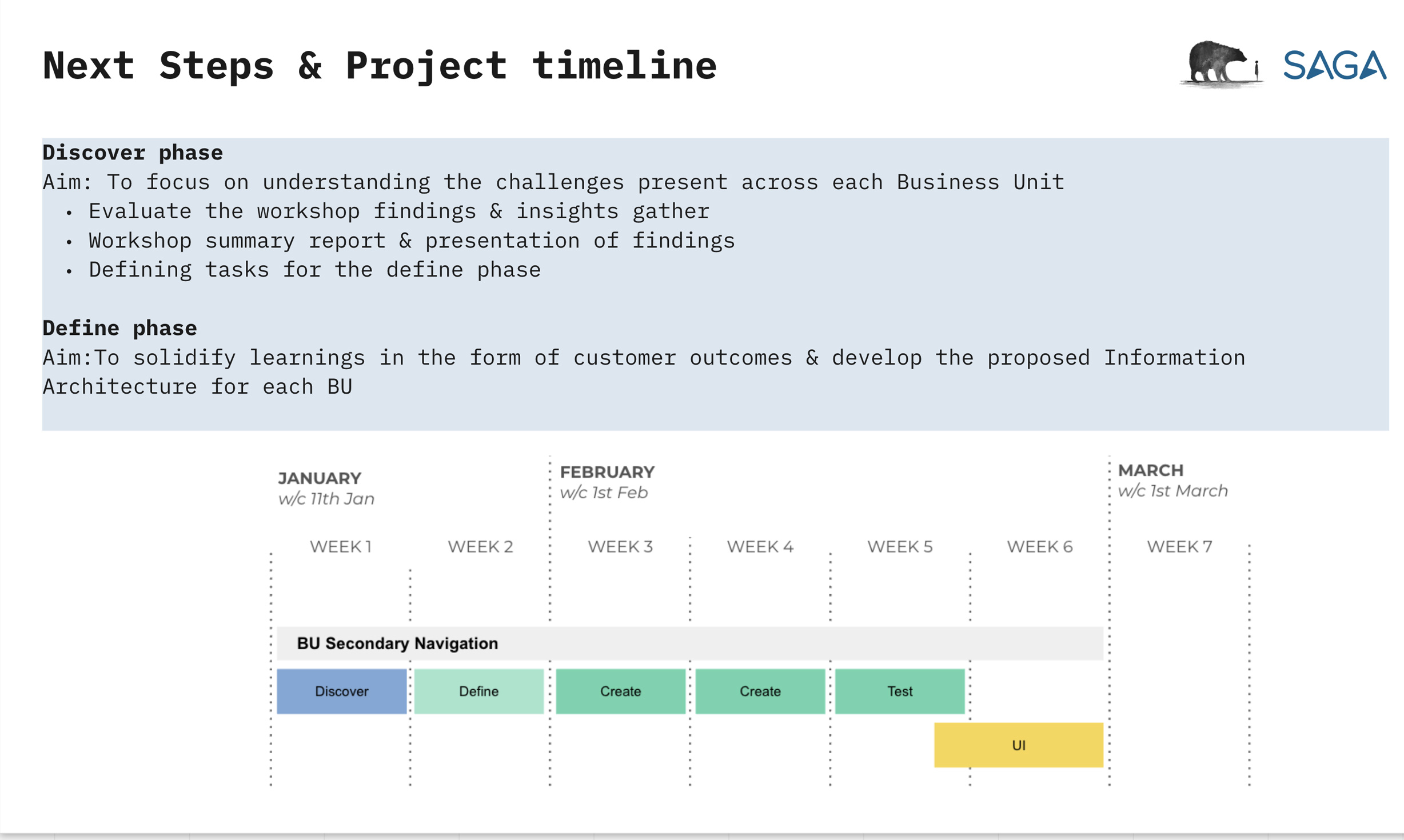
Axure prototypes.
Two days of testing prototypes
Synthesis
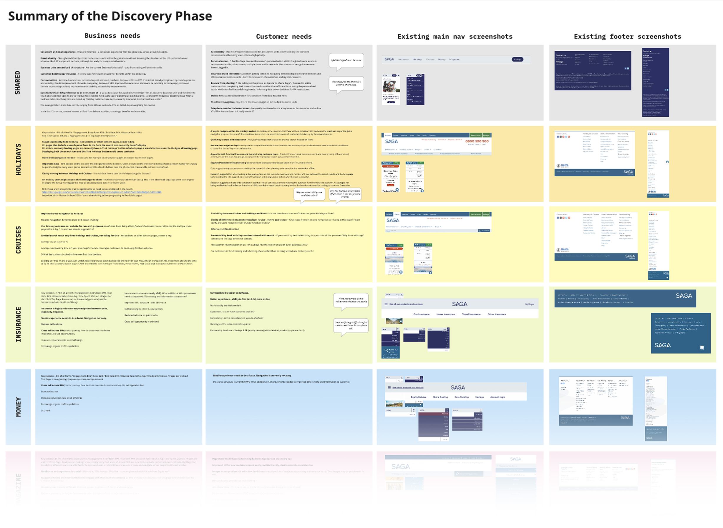
Synthesised research which included workshops data and desktop research including personas, metrics and competitor review.
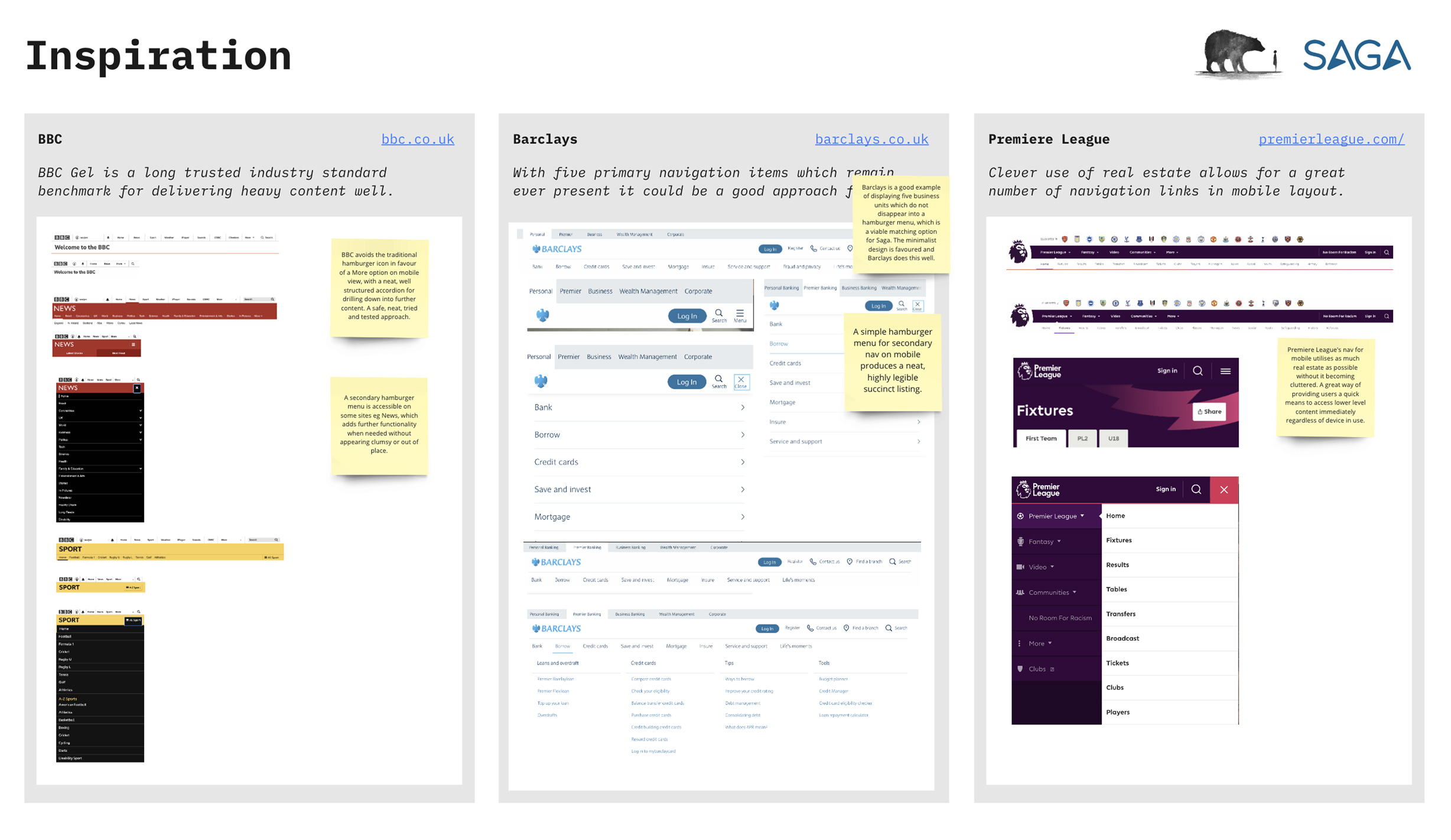
Competitor review
Indepth look at what similarly aligned competitors were doing with their global nav. Six were laid out to present, three of which were of a conservative nature, and three were more dynamic and sophisticated. Key considerations were how these navs promoted cross pollination between business units, how they translated across device widths and what methods were used to promote onward journeys.
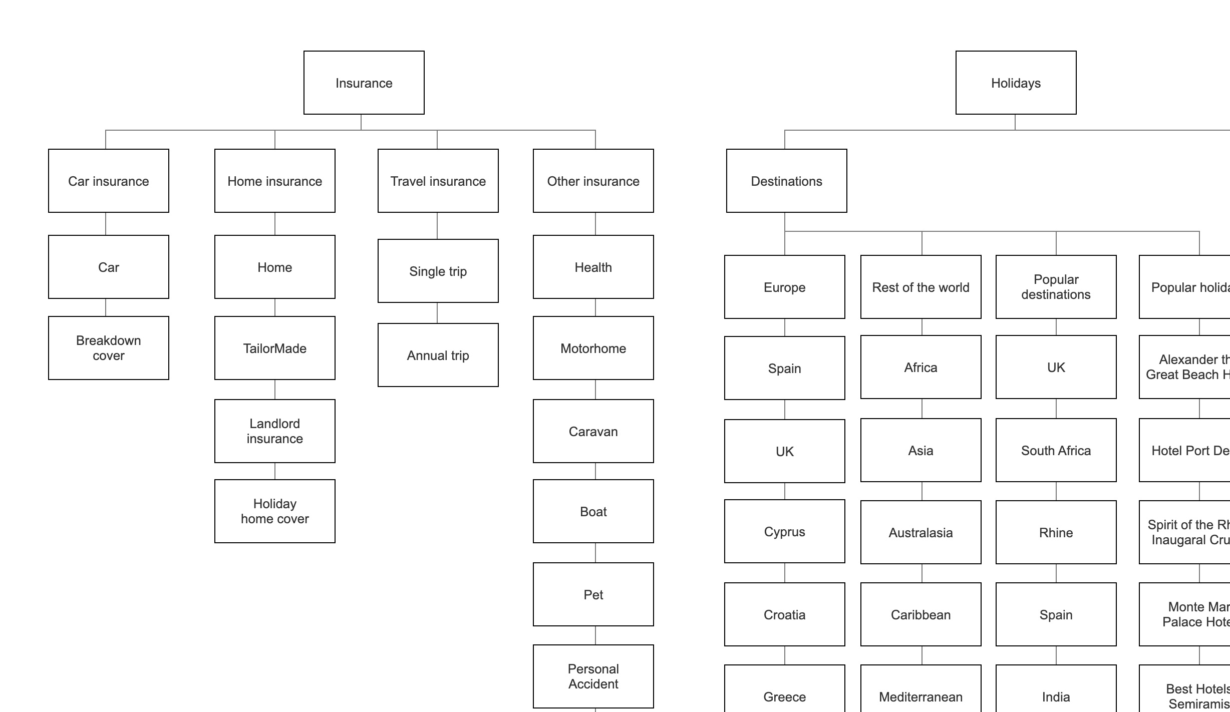
Sitemap restructure
The global nav specific sitemap was laid out in Miro, with the purpose of the first workshop with the client being a discussion on opinions on content structure, dead pages, the translation of nav to footer. The clients were prompted to add colour coded post it notes to areas of the sitemap. The entire length and breadth of the projejct was included in Miro for visibility and efficiency.
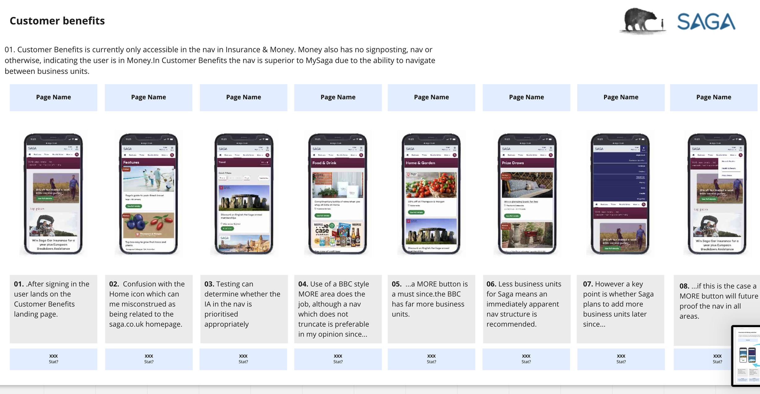
User journeys
Key user journeys were then mapped out which included things such as what the user does currently when switching from Money to Insurance, and what the future looks like for this. Tooltips were introduced to promote cross pollination.
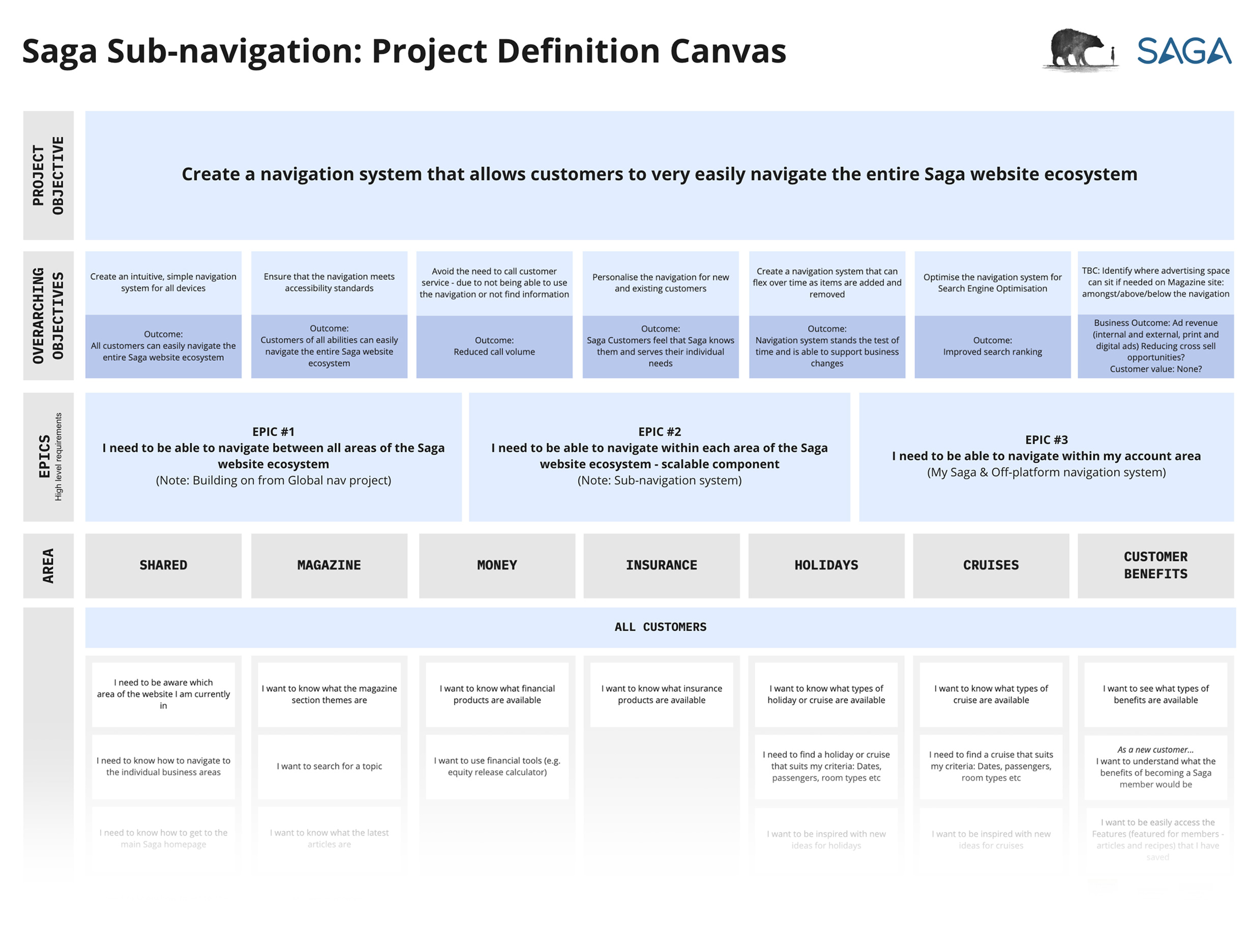
User stories
User stories were mapped out in Miro whereby after the presentation the client were again prompted to comment using post it notes on anything they perceived worthy of discussion or amendment. User stories were grouped appropriately beneath Epics. Prototypes were then created in Axure.
Wireframes & finished UI
With discovery complete the Axure prototypes and test scripts were created, with sophisticated interactions tio match the end product. Synthesis of the test data lead to the finished designs which can be seen on the live site currently.
Wireframes & finished UI
With discovery complete the Axure prototypes and test scripts were created, with sophisticated interactions tio match the end product. Synthesis of the test data lead to the finished designs which can be seen on the live site currently.
